Looking at the Data
One of the really nice things about Slicer is that it automatically shows the image with three orthoganal slices. These should appear in three little windows in the lower right of your Slicer screen.
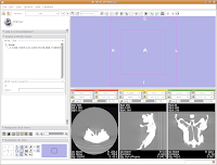
You'll notice that the images are a little small, and that they look a little washed out. Never fear, there are ways to fix this! Let's take care of them one at a time.
In order to resize the images, mouse across the toolbar at the top of the screen, until you see the button that pops up with a menu that says "Choose among layouts for the 3D and slice viewers." It looks like a little mini version of the Slicer screen. Click on it, and select "Four-up layout". This shrinks the lavender winder (the 3D window that will eventually display your model) and makes the CT slices bigger.
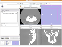
Next, go to the same menu and select "Red slice only layout." Now, the view in the red slice should fill the whole screen. Get the idea? We'll leave it in the current view for now.

Next, let's take care of the washed-out look of the CT slice. This is a problem fixed by adjusting the windows and levels. Essentially, this is a fancy CT imaging trick akin to adjusting brightness and contrast of a picture in Photoshop (or GIMP). To play with this, go to the toolbar at the top again, and find the drop-down menu net to "Modules:". Under this menu, click on "Volumes." A new interface pops up on the left side of the screen, and we can get down to business.
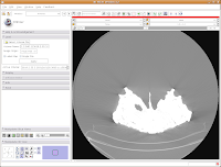
The important part of this multi-layered interface is labeled "Display." So, click on this. If you have to, scroll down so that the whole "Display" module is in view.
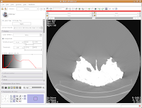
Now, you'll see a little slider beneath the row that says, "Window/Level". Click and drag with your mouse on this slider to start changing the windows and levels. As you do so, you should note the CT slice at left changing. If you click on one of the window/level handles, you can drag it around to the left or right (on either slider). If you click on the space between the two sliders and drag, you'll move both sliders together. If you don't feel like all this stupid GUI stuff, you can just type values in the boxes above the sliders. In the end, I liked what I saw at 4451.4,1507.5. The shades of black were distinctive on my monitor, and I saw nice contrast between the fossil bone and matrix.
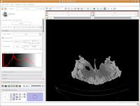
Let's play with the data! To move back and forth through the stack of images, move the slider above the CT image. You'll see the visible images change forward and backward through the skull. Pretty cool, huh? The number at right tells you how many millimeters you are through the image, from the midpoint of the stack. Notice that as you move the slider, the numbers move by increments of 1.25 mm - this is the slice thickness of the scan. Type in "105.5" and then hit enter. You should see the image jump to this slice.
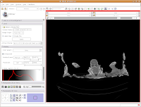
What if you want to zoom in a little? By clicking and dragging with your right mouse button, you can accomplish this. Zoom in on the endocranial cavity, the gray-filled area at the center of the skull. If you need to pan around the image, click and hold the middle mouse button (a wheel on many mouses) while dragging. This will move the image, and you can reposition it as appropriate. If you just move the mouse wheel, you'll cycle back and forth through the slices. Give it a try, and see what happens!
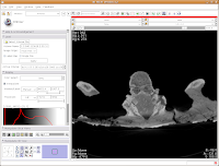
To return to the original view, find the little button just to the left of the slider bar. If you hover your mouse over it, it should say "Displays a menu of more options for the Slice Viewer." Click on it, and select "Fit to Window." And now, you're back where you started!

The current slice is in an "axial" section (actually, coronal, if going by the proper anatomical planes). What if you want to see another view? The easiest option is to go up to tool bar again, and back to that button that pops up with a menu that says "Choose among layouts for the 3D and slice viewers." You can select "Yellow Slice only layout" or whatever your heart desires. You may have to "Fit to Window" again, to get it all in screen.
For the next phase of the tutorial, go back to the "Red Slice only layout," and fit it to the window.
Here ends the second part of the tutorial. In the next post, we'll learn how to segment the data.

3 comments:
Fantastic! I have always wanted to learn about this stuff but due to lack of resources (software,scan data) I never got a chance to learn this stuff previously.
BTW, You wouldn't happen to know any good open source programs for data plotting. I use PAST but the pixelated graphics really annoy me.
Lately, I've been using the graphical functions of R. It can be a complicated program to learn, but there are quite a few options available, in terms of types of plots and ways to modify the plots. The histograms in my recent goat head paper were all generated in R - I chose this option because it best dealt with the massive data files. For simple stuff, there's always OpenOffice.org.
In the meantime - isn't there an option in PAST to copy a graph to the clipboard in a vector format readable by other programs? Or does it just copy as bitmaps?
Hi Andy,
I'm using a Mac which has a mouse with only 1 button. How do I accomplish the zoom in/zoom out thing without right clicking? Thanks!
-Eugenia
Post a Comment